「来期アニメ」アプリでアニメのジャンルがわかるようにしたいと思って、Chipウィジェットが使えそうなのでどんな感じか試して見ました。
参考にした記事
Chip Widgets In Flutter
Flutter widgets are built using a modern framework that takes inspiration from React. We have learned before that everything in Flutter is…
medium.flutterdevs.com
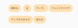
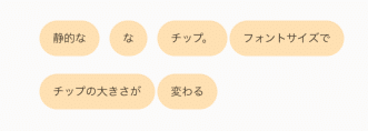
Chip
静的なChipです。ラベルのように使えます。
Wrap chipList() {
   return Wrap(
     spacing: 2.0, // Chip間の距離
     //runSpacing: 2.0, // 行間
     children: <Widget>[
       _buildChip('静的な', Colors.orange.shade100),
       _buildChip('な', Colors.orange.shade100),
       _buildChip('チップ。', Colors.orange.shade100),
       _buildChip('フォントサイズで', Colors.orange.shade100),
       _buildChip('チップの大きさが', Colors.orange.shade100),
       _buildChip('変わる', Colors.orange.shade100),
     ],
   );
}

Widget _buildChip(String label, Color color) {
    return Chip(
      //labelPadding: EdgeInsets.all(2.0),
      // avatar: CircleAvatar(
      //   backgroundColor: Colors.white70,
      //   child: Text(label[0].toUpperCase()),
      // ),
      label: Text(
        label,
        style: TextStyle(
          color: Colors.black87,
          fontSize: 10,
        ),
      ),
      backgroundColor: color,
      //elevation: 6.0, // 影の大きさ
      //shadowColor: Colors.grey[60], // 影の色
      //padding: EdgeInsets.all(8.0),
    );
}
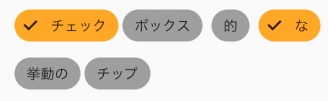
FilterChip
複数選択可能なChipです。チェックボックスのように使えます。
Wrap(
  spacing: 4.0,
  runSpacing: 0.0,
  children: filterChip.toList(),
),

Iterable<Widget> get filterChip sync* {
   for (FilterChipItemWidget filterChipItem in _filterChipItems) {
     yield FilterChip(
       //backgroundColor: Colors.tealAccent[200],
       backgroundColor: Colors.grey,
       // avatar: CircleAvatar(
       //   backgroundColor: Colors.cyan,
       //   child: Text(
       //     company.name[0].toUpperCase(),
       //     style: TextStyle(color: Colors.white),
       //   ),
       // ),
       label: Text(
         filterChipItem.name,
       ),
       selected: _filters.contains(filterChipItem.name),
       selectedColor: Colors.orange.shade400,
       onSelected: (bool selected) {
         setState(() {
           if (selected) {
             _filters.add(filterChipItem.name);
           } else {
             _filters.removeWhere((String name) {
               return name == filterChipItem.name;
             });
           }
         });
       },
     );
   }
 }

 _filterChipItems = <FilterChipItemWidget>[
     FilterChipItemWidget('チェック'),
     FilterChipItemWidget('ボックス'),
     FilterChipItemWidget('的'),
     FilterChipItemWidget('な'),
     FilterChipItemWidget('挙動の'),
     FilterChipItemWidget('チップ'),
 ];

class FilterChipItemWidget {
 const FilterChipItemWidget(this.name);
 final String name;
}
ActionChip
押すと反応するChipです。ボタンのように使えます。
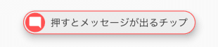
  Widget _buildActionChips() {
   return ActionChip(
     elevation: 8.0,
     padding: EdgeInsets.all(2.0),
     avatar: CircleAvatar(
       backgroundColor: Colors.redAccent,
       child: Icon(
         Icons.mode_comment,
         color: Colors.white,
         size: 20,
       ),
     ),
     label: Text('押すとメッセージが出るチップ'),
     onPressed: () {
       ScaffoldMessenger.of(context).showSnackBar(
         SnackBar(content: Text('チップメッセージです。')),
       );
     },
     backgroundColor: Colors.grey[200],
     shape: StadiumBorder(
         side: BorderSide(
       width: 1,
       color: Colors.redAccent,
     )),
   );
 }
ChoiceChip
選択可能なChipです。セレクトボックスのように使えます。
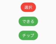
  Widget _buildChoiceChips() {
   return Container(
     height: MediaQuery.of(context).size.height / 4,
     child: ListView.builder(
       itemCount: _choices.length,
       itemBuilder: (BuildContext context, int index) {
         return ChoiceChip(
           label: Text(_choices[index]),
           selected: _choiceIndex == index,
           selectedColor: Colors.red,
           onSelected: (bool selected) {
             setState(() {
               _choiceIndex = selected ? index : 0;
             });
           },
           backgroundColor: Colors.green,
           labelStyle: TextStyle(color: Colors.white),
         );
       },
     ),
   );
 }

 _choices = ["選択", "できる", "チップ"];
InputChip
多機能なChipです。全て?のChipの機能を持っています。
使い所はよくわかりません。
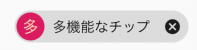
  Widget _buildInputChips() {
   return InputChip(
     padding: EdgeInsets.all(2.0),
     avatar: CircleAvatar(
       backgroundColor: Colors.pink.shade600,
       child: Text('多'),
     ),
     label: Text(
       '多機能なチップ',
       style: TextStyle(color: _isSelected ? Colors.white : Colors.black),
     ),
     selected: _isSelected,
     selectedColor: Colors.blue.shade600,
     // onPressed: () {
     //   ScaffoldMessenger.of(context).showSnackBar(
     //     SnackBar(content: Text('チップを押せます。')),
     //   );
     // },
     onSelected: (bool selected) {
       ScaffoldMessenger.of(context).showSnackBar(
         SnackBar(content: Text('チップの選択ができます。')),
       );
       setState(() {
         _isSelected = selected;
       });
     },
     onDeleted: () {
       ScaffoldMessenger.of(context).showSnackBar(
         SnackBar(content: Text('チップの削除ができます。')),
       );
     },
   );
 }
まとめ
checkboxだけでなく、label, button, select代わりにも使えるので何かと重宝しそうな予感です。
また、Chipとは関係ないですが、今回の調査でWrapウィジェットを初めて知りました。
結構便利なのでこちらも使い所ありそうです。
とりあえず、「来期アニメ」アプリでは、FilterChipを使ってみました。
来期アニメ-「来期のアニメ何観よう」を解決!
アニメ改編期ごとに、・来期のアニメ一覧を探す・良さそうなアニメをピックアップ・アニメ録画予約を入れるこれらの作業がいつも面倒で忘れがちなので、同じような悩みを持っている方に向けてアプリ化しました。◆「来期アニメ」一覧画面ホーム画面は、基本的に「来期アニメ」の一覧を表示します。新着順に並べてあるので追加があればすぐにわ...
apps.apple.com
来期アニメ:「来期のアニメ、何観よっかな」をサポート! - Google Play のアプリ
来期スタートの新作アニメの最新情報をシンプルにお届け
play.google.com
ソース全文
import 'package:flutter/material.dart';

void main() {
 runApp(MyApp());
}

class MyApp extends StatelessWidget {
 @override
 Widget build(BuildContext context) {
   return MaterialApp(
     title: 'Flutter Demo',
     theme: ThemeData(
       primarySwatch: Colors.orange,
     ),
     home: MyHomePage(),
   );
 }
}

class MyHomePage extends StatefulWidget {
 @override
 _MyHomePageState createState() => _MyHomePageState();
}

class _MyHomePageState extends State<MyHomePage> {
 late GlobalKey<ScaffoldState> _key;
 late bool _isSelected;
 late List<FilterChipItemWidget> _filterChipItems;
 late List<String> _filters;
 late List<String> _choices;
 late int _choiceIndex;

 @override
 void initState() {
   super.initState();
   _key = GlobalKey<ScaffoldState>();
   _isSelected = false;
   _choiceIndex = 0;
   _filters = <String>['チェック', 'な'];
   _filterChipItems = <FilterChipItemWidget>[
     FilterChipItemWidget('チェック'),
     FilterChipItemWidget('ボックス'),
     FilterChipItemWidget('的'),
     FilterChipItemWidget('な'),
     FilterChipItemWidget('挙動の'),
     FilterChipItemWidget('チップ'),
   ];
   _choices = ["選択", "できる", "チップ"];
 }

 @override
 Widget build(BuildContext context) {
   return Scaffold(
     appBar: AppBar(
       title: Text('Chip Test'),
     ),
     body: Center(
       child: Column(
         mainAxisAlignment: MainAxisAlignment.center,
         children: <Widget>[
           chipList(),
           Container(height: 20),
           Wrap(
             spacing: 4.0, // gap between adjacent chips
             runSpacing: 0.0, // gap between lines
             children: filterChip.toList(),
           ),
           Container(height: 20),
           _buildActionChips(),
           Container(height: 20),
           _buildChoiceChips(),
           Container(height: 20),
           _buildInputChips(),
         ],
       ),
     ),
   );
 }

 Wrap chipList() {
   return Wrap(
     spacing: 2.0,
     //runSpacing: 2.0,
     children: <Widget>[
       _buildChip('静的な', Colors.orange.shade100),
       _buildChip('な', Colors.orange.shade100),
       _buildChip('チップ。', Colors.orange.shade100),
       _buildChip('フォントサイズで', Colors.orange.shade100),
       _buildChip('チップの大きさが', Colors.orange.shade100),
       _buildChip('変わる', Colors.orange.shade100),
     ],
   );
 }

 Widget _buildChip(String label, Color color) {
   return Chip(
     //labelPadding: EdgeInsets.all(2.0),
     // avatar: CircleAvatar(
     //   backgroundColor: Colors.white70,
     //   child: Text(label[0].toUpperCase()),
     // ),
     label: Text(
       label,
       style: TextStyle(
         color: Colors.black87,
         fontSize: 10,
       ),
     ),
     backgroundColor: color,
     //elevation: 6.0, // 影の大きさ
     //shadowColor: Colors.grey[60], // 影の色
     //padding: EdgeInsets.all(8.0),
   );
 }

 Widget _buildActionChips() {
   return ActionChip(
     elevation: 8.0,
     padding: EdgeInsets.all(2.0),
     avatar: CircleAvatar(
       backgroundColor: Colors.redAccent,
       child: Icon(
         Icons.mode_comment,
         color: Colors.white,
         size: 20,
       ),
     ),
     label: Text('押すとメッセージが出るチップ'),
     onPressed: () {
       ScaffoldMessenger.of(context).showSnackBar(
         SnackBar(content: Text('チップメッセージです。')),
       );
     },
     backgroundColor: Colors.grey[200],
     shape: StadiumBorder(
         side: BorderSide(
       width: 1,
       color: Colors.redAccent,
     )),
   );
 }

 Widget _buildInputChips() {
   return InputChip(
     padding: EdgeInsets.all(2.0),
     avatar: CircleAvatar(
       backgroundColor: Colors.pink.shade600,
       child: Text('多'),
     ),
     label: Text(
       '多機能なチップ',
       style: TextStyle(color: _isSelected ? Colors.white : Colors.black),
     ),
     selected: _isSelected,
     selectedColor: Colors.blue.shade600,
     // onPressed: () {
     //   ScaffoldMessenger.of(context).showSnackBar(
     //     SnackBar(content: Text('チップを押せます。')),
     //   );
     // },
     onSelected: (bool selected) {
       ScaffoldMessenger.of(context).showSnackBar(
         SnackBar(content: Text('チップの選択ができます。')),
       );
       setState(() {
         _isSelected = selected;
       });
     },
     onDeleted: () {
       ScaffoldMessenger.of(context).showSnackBar(
         SnackBar(content: Text('チップの削除ができます。')),
       );
     },
   );
 }

 Iterable<Widget> get filterChip sync* {
   for (FilterChipItemWidget filterChipItem in _filterChipItems) {
     yield FilterChip(
       //backgroundColor: Colors.tealAccent[200],
       backgroundColor: Colors.grey,
       // avatar: CircleAvatar(
       //   backgroundColor: Colors.cyan,
       //   child: Text(
       //     company.name[0].toUpperCase(),
       //     style: TextStyle(color: Colors.white),
       //   ),
       // ),
       label: Text(
         filterChipItem.name,
       ),
       selected: _filters.contains(filterChipItem.name),
       //selectedColor: Colors.purpleAccent,
       selectedColor: Colors.orange.shade400,
       onSelected: (bool selected) {
         setState(() {
           if (selected) {
             _filters.add(filterChipItem.name);
           } else {
             _filters.removeWhere((String name) {
               return name == filterChipItem.name;
             });
           }
         });
       },
     );
   }
 }

 Widget _buildChoiceChips() {
   return Container(
     height: MediaQuery.of(context).size.height / 4,
     child: ListView.builder(
       itemCount: _choices.length,
       itemBuilder: (BuildContext context, int index) {
         return ChoiceChip(
           label: Text(_choices[index]),
           selected: _choiceIndex == index,
           selectedColor: Colors.red,
           onSelected: (bool selected) {
             setState(() {
               _choiceIndex = selected ? index : 0;
             });
           },
           backgroundColor: Colors.green,
           labelStyle: TextStyle(color: Colors.white),
         );
       },
     ),
   );
 }
}

class FilterChipItemWidget {
 const FilterChipItemWidget(this.name);
 final String name;
}
コメント
[…] […]